This experiment was about completely rethinking ArdaCraft's website to clear the bottleneck that was holding the community's growth back. In 150 hours over 3 months, I migrated from Webflow to a decentralized architecture (WordPress and Webstudio, headless via GraphQL), cutting our hosting costs tenfold (-90%). On the experience side, a data-driven redesign boosted usage of key features by up to 3× on one of our most visited pages.
The context
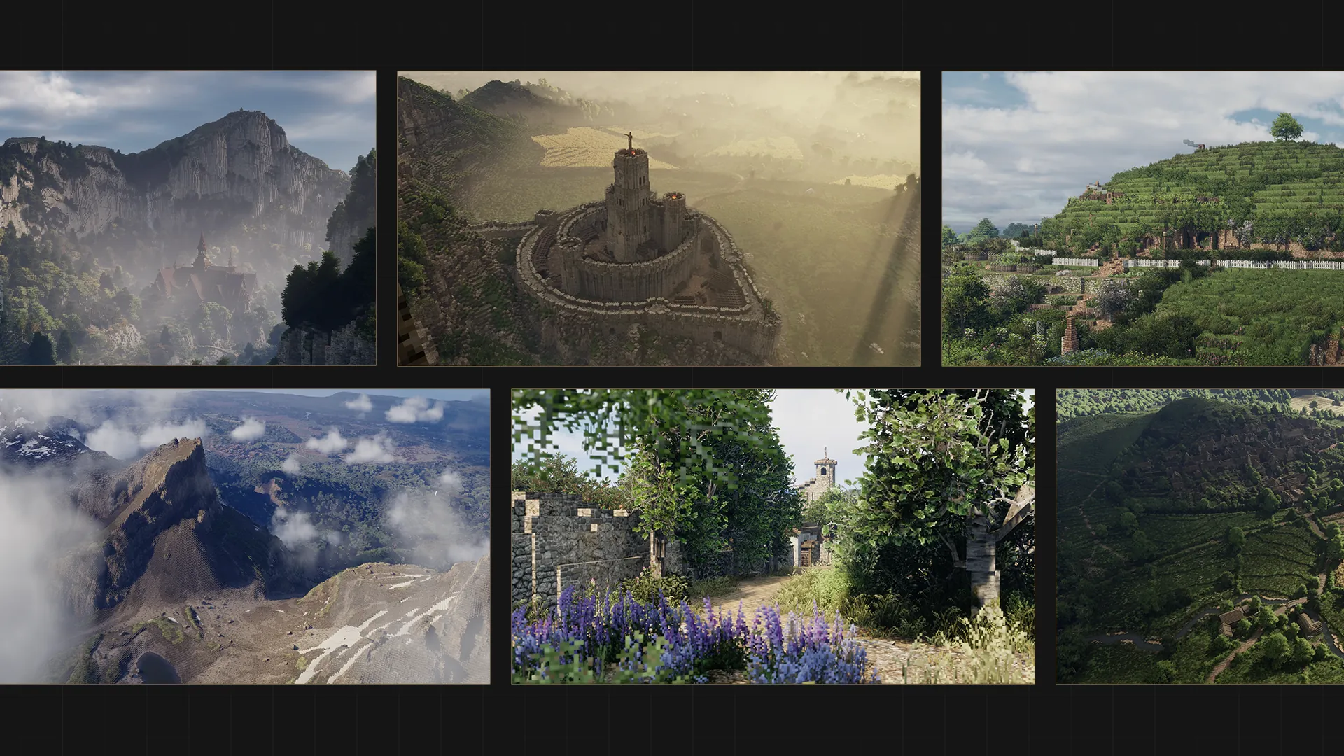
ArdaCraft is an international collaborative project whose ambition is to meticulously recreate Middle-earth (the universe of The Lord of the Rings and The Hobbit). I initially joined the adventure to create videos, before taking on more responsibilities to challenge myself and explore new horizons.
In 2024 I produced 24 videos for the project's Instagram account. They gathered 27.3 million views and took the account from 9,877 to more than 115,000 followers, a run I cover in a separate study. The number of visitors to the site, though, was not taking off. I quickly understood the problem. Our website was a bottleneck. For a curious user, figuring out how to start exploring the world was an obstacle course.
The price of success
Together with another member, I rebuilt the site, more complete this time, and aligned with our goals: growing the community and establishing ArdaCraft as a reference among Tolkien fans.
Built on Webflow, that first redesign was a critical success. Carried by our communication strategy, it attracted more than 217,000 visitors in its first year. That's when the trouble started.
We hit the limit of our Webflow plan. Upgrading to the next tier would have multiplied our costs by five. For a community project that survives on donations alone, that was impossible. We needed a solution that could grow with us without draining our treasury.
Our New Technical Architecture
To work around this financial constraint, we migrated to a decentralized solution. I had to learn several new tools. The challenge was substantial: thousands of data points had to be moved, and WordPress and Webstudio had to communicate via GraphQL to dynamically manage hundreds of pages in headless mode. I even had to build a custom Python script to compress thousands of images to WebP and optimize performance.
This redesign and migration took me a good 150 hours of work spread over 3 months. Although I was the main contributor on this part, I am deeply grateful to everyone on the team who lent a hand from time to time; their constant support was an essential driving force.
I built everything on 3 pillars:
- Visual impact: a striking design to bring out our personality.
- An efficient journey: logical navigation to guide the visitor.
- Adaptability: a smooth experience from smartphone to desktop.
1. Visual impact
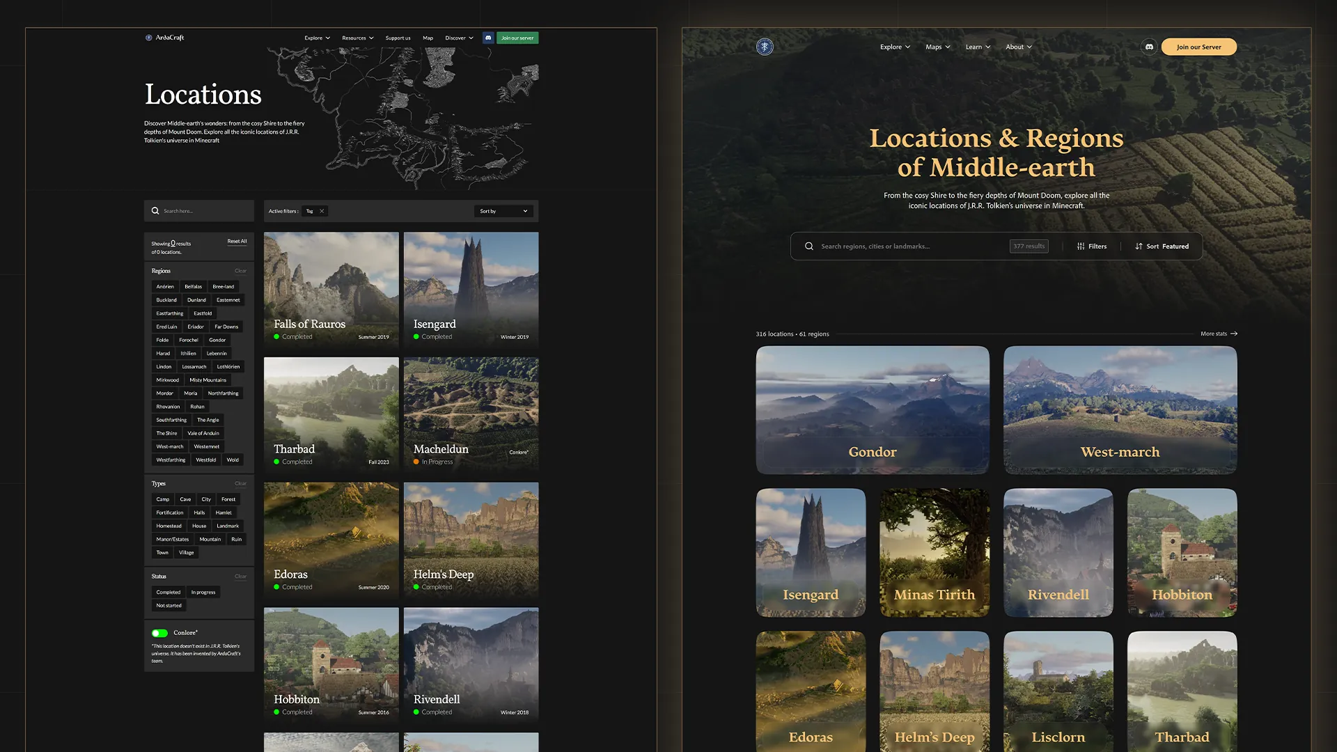
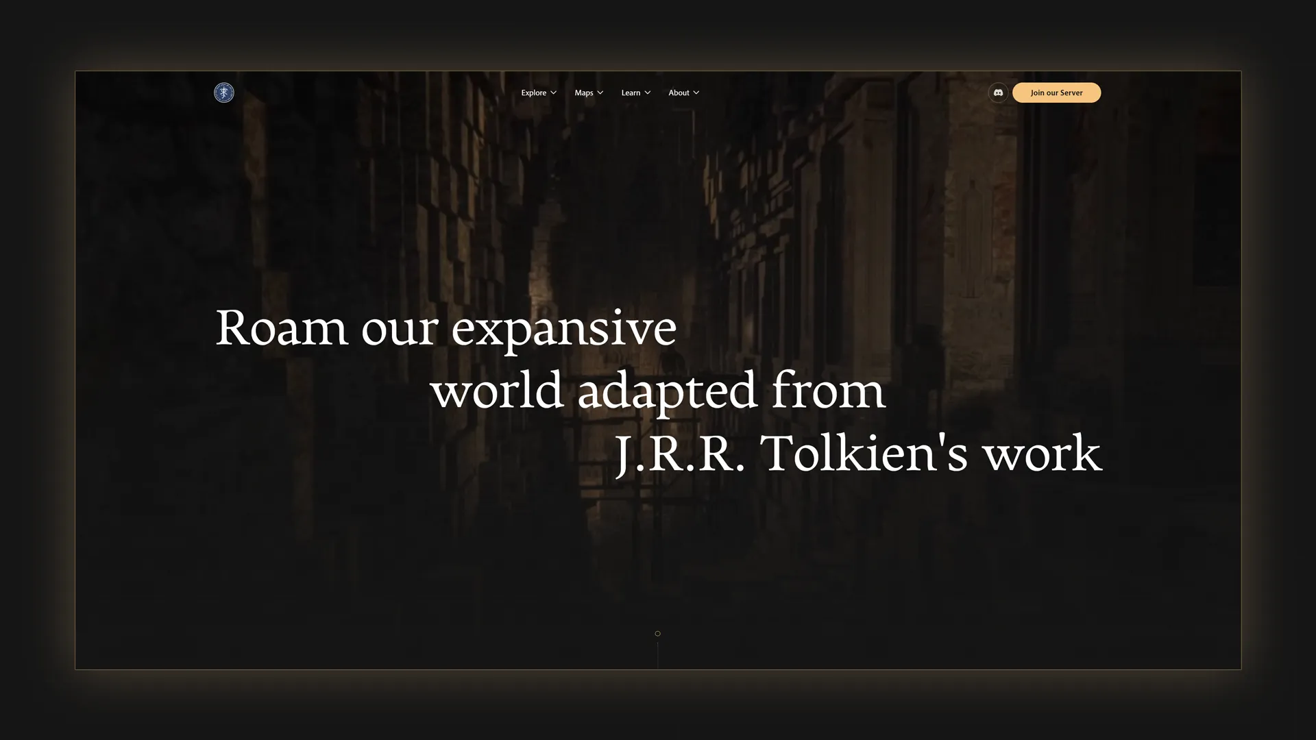
Redesigning every single page was a colossal task. After a research phase in Figma, I introduced strong visual concepts: extensive use of a "gold" color, "shiny" effects on interactive elements, and glassmorphism.
My watchword was immersion. How do you make bold creative choices without degrading navigation? The key was subtlety: working with background images and gradients, using glassmorphism sparingly, and drastically reducing the number of elements visible on screen.
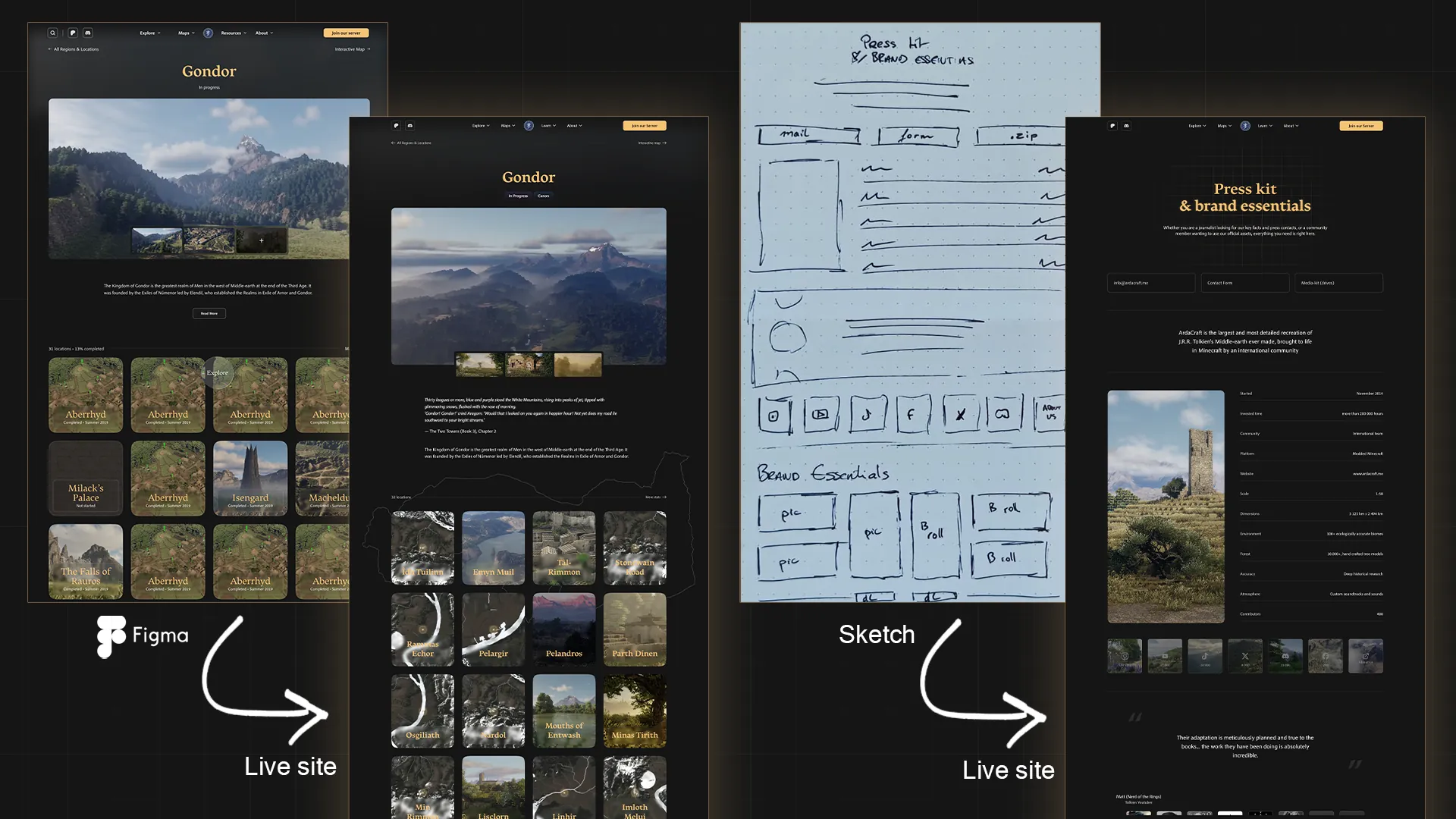
While it's nearly impossible to measure the real impact of a new design on a volunteer project like ours, the gain lies elsewhere: we finally have strong visual consistency across every page, and the site now acts as a solid pillar of ArdaCraft's brand identity.
2. An efficient journey
To optimize the user journey, I relied on Microsoft Clarity, a UX analytics tool that lets you visualize user behavior (through heatmaps and session recordings). The finding was simple: most elements cut off by the bottom of the viewport were never used. So I moved these key features to the top of the page to make them immediately accessible.
The page listing all the locations from The Lord of the Rings is one of the most visited. Applying this logic, the results were immediate. With comparable traffic between December 2025 and June 2026, feature usage soared:
| Feature | Usage in December 2025 | Usage in June 2026 | Overall change |
|---|---|---|---|
| Search | 2.98% | 5.09% | +71% |
| Filters | 1.17% | 7.64% | +555% |
| Sorting | 1.55% | 4.99% | +222% |
These changes are a great success, and we will keep optimizing this experience.
3. Adaptability
Many major features, like the interactive map or the filters, simply weren't suited to smartphones. One of the big work streams was therefore rethinking these elements for mobile.
We had also noticed that the old mobile menu was neglected because it was too complex. The new version offers an extremely simple menu, which has radically eased navigation for our on-the-go users.
What came next
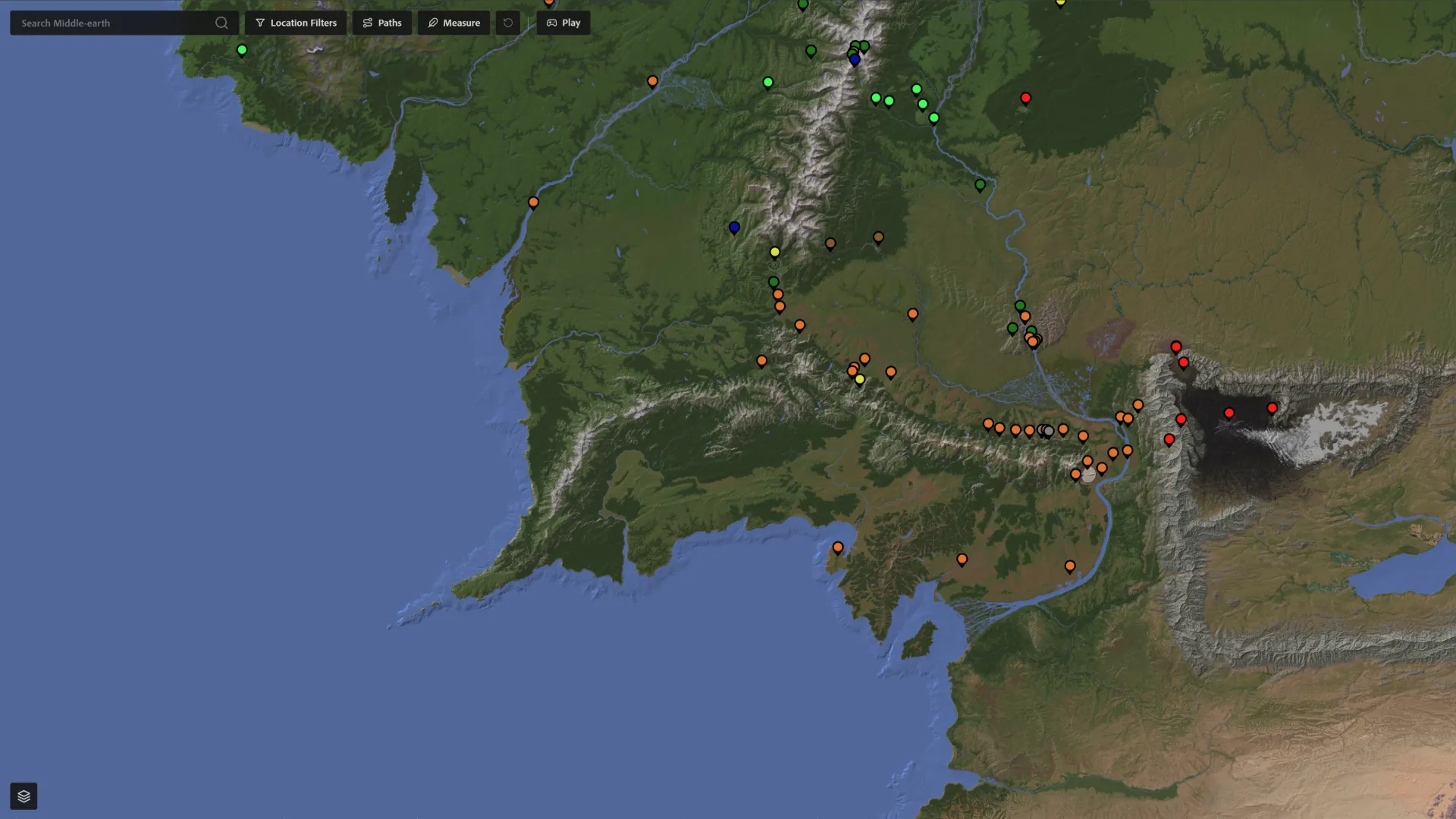
The community welcomed this new version very warmly; the site is considered far more useful and pleasant to use day to day. We received particularly enthusiastic feedback about the interactive map.
ArdaCraft is a project grounded in deep research into geology, botany, history and their influence on Tolkien's world. Our map aims to bring all these scientific and narrative elements together for enthusiasts, establishing itself as the ultimate immersion tool into our universe (which will, incidentally, be the subject of a dedicated upcoming article!).
As for what comes next? I'm already working on my next challenge: designing V3 of that famous interactive map.