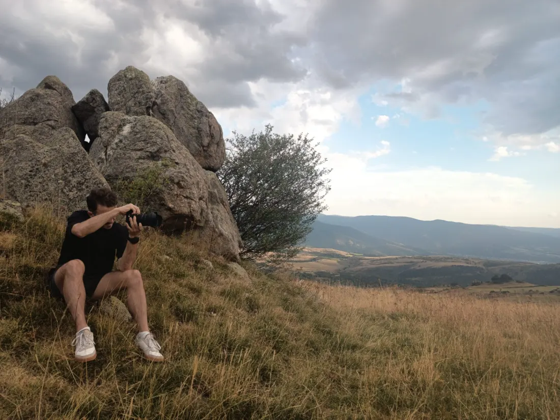
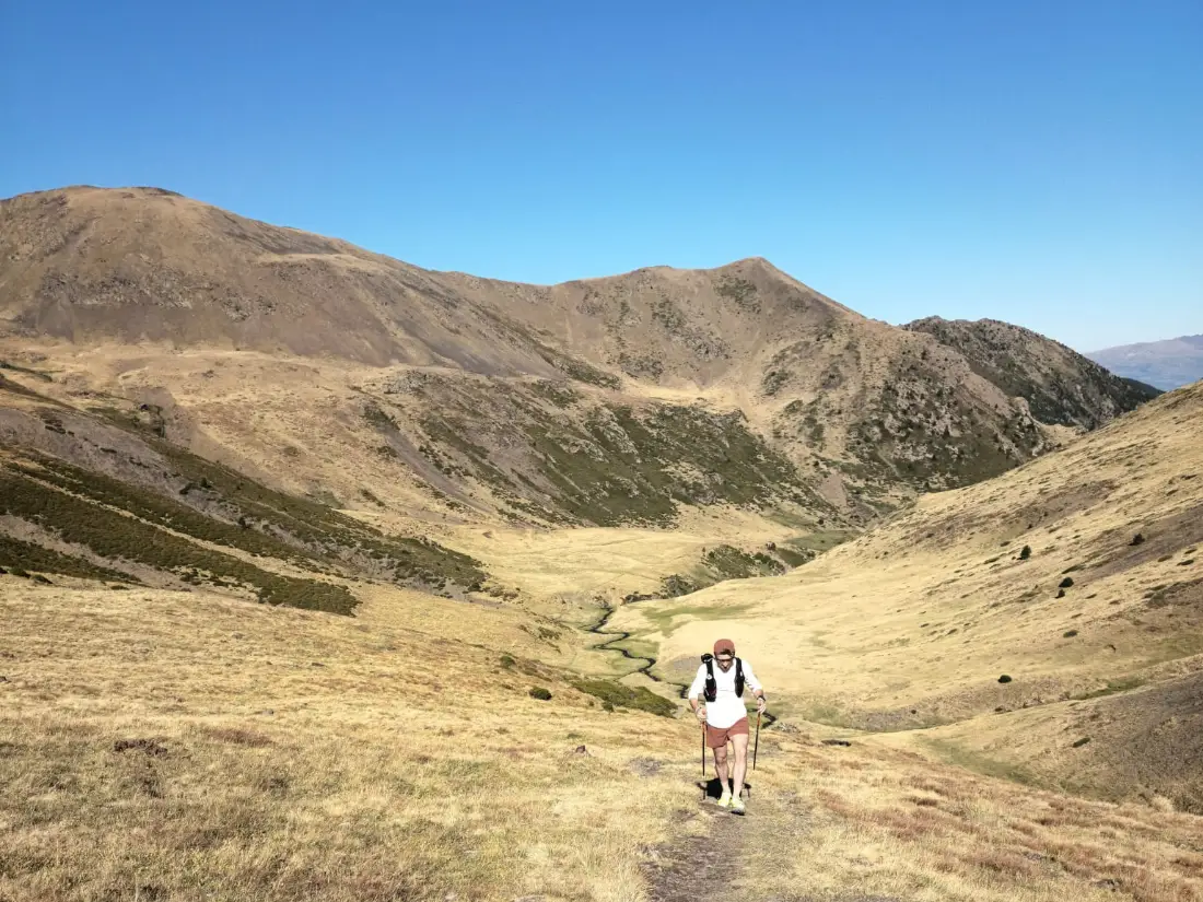
I sketch and plan my projects on dot-grid paper. The site sits on the same surface, and this page sets out the rules before they reach the rest of the portfolio.The pierre.gumi.ch system
01
Voice
Direct, creative, no jargon. I pitch it to whoever is reading.
Be direct and useful
I adapt to whoever I am talking to and lay out the specifics of the subject clearly.
“Lift your ROI by 20% with this targeted Google Ads campaign structure.”
“Our magic method will make your search engine sales explode!”
Write like a human
AI can help with writing, but anything that gives away generated text has to go: em dashes, mirrored structures (“it’s not X, it’s Y”), empty superlatives, decorative emojis, over-formatted lists. The finished text should sound like someone talking.
“One clear goal: create impact, for the user and for the business.”
“One clear goal — creating impact — for the user and the business.”
Share the process
I state what is at stake and when it lands, so everyone works from the same context.
“V1 ships Tuesday. We will need your feedback by Thursday noon.”
“We will handle it quickly, promise, no need to worry about the rest.”
02
The paper
A sheet of dot-grid paper, the notebooks I sketch my projects on. Headings are written on its rows, and anything laid on top of it is opaque.
One single screen
A printer's halftone. The page edges carry a full screen that shrinks towards the centre; what is left forms the grid. The ink never varies, dot size carries the tone.
20 × 18 pxThe full screen, used by the gradient bands.
80 × 72 pxThe middle grid, one column and one row in four. This is what headings are written on.
3 pxThe grid dot radius. It rises to 7px at the top of the page, and gains another 2.5px towards the left and right edges.
250 pxThe height of the dense bands, top and bottom alike.
0,04The field ink, identical across the whole page.
A heading’s row
Every heading's baseline falls on a row of the grid, and that row is redrawn at 0.18 ink. It is the section that shifts so the heading lands there, never the heading on its own.
03
Colours
One ink, one paper. Hierarchy is built from opacity, never from a change of hue. Purple is reserved for interactive states.
The ink scale
Ten values, each with a job. Click a row to copy its value.
Headings and strong text1
Body copy and quotes0,78
Section introductions0,7
Handwritten annotations0,62
Dates and side notes0,5
Captions and dimmed text0,45
Rules and borders0,14
Inner borders0,12
Block backgrounds0,035
Light backgrounds0,022
The two themes
Dark is not an inversion. The paper turns a violet-tinted grey, the ink turns ivory, and the purple lightens to hold its contrast.
Light
Paper#F9F4EF
Ink#1A1A1A
Interaction#6B45C9
Dark
Paper#1B1A1F
Ink#F1ECE4
Interaction#B49BFF
Purple only shows up in response
On pierre.gumi.ch the colour appears in four places: the current rail entry, keyboard focus, link hover, and the icon of an open project. Everywhere else, ink is enough. Hover these links to see the rule at work.
Urbanist for everything printed, Cedarville Cursive for everything handwritten over it. A heading carries no closing punctuation.
Urbanist Black 900 · H1
Direct and creative
Urbanist Bold 700 · H2
Tools and experiments
Urbanist Medium 500 · Corps
The Medium weight keeps interfaces and tool descriptions as legible as possible. Clean, technical, functional. Every word has its place and the weight carries the eye.
Cedarville Cursive 400 · Annotations
This part is handwritten.
05
Annotations
What I add in a notebook margin after the fact. Absolutely positioned, out of the flow and out of the accessibility tree: remove them and the layout does not move. They are centred here so they can be compared.
It points at the element
The arrow
Circled afterwards
The circled word
Underlined by hand
The margin note
A clarification
The asterisk
That’s me!
The curved arrow
Proofread the pageDrop the paper grain
The task, ticked or not
These threebelong together
The brace
insert here
The insertion mark
Take another look
The wavy underline
The rules
Ink0.62. The same ink as the page, just lighter. A handwritten note has no colour of its own.
SizeA note fits on one line and never wraps. Its size follows the window width, and everything in it is expressed in em, so it grows as one piece.
PlacementAbsolutely positioned against the annotated element, with an offset expressed in em: above the top edge for the arrow, in the left margin for the margin note, on the name's line for the asterisk.
Interactionpointer-events: none, without exception. A note is not clickable and never blocks a link it covers.
06
Icons
Lucide, untouched. A 24 grid, a stroke of 2, rounded caps and joins. The geometry stays the library’s own, which is what guarantees that an icon added later sits properly beside the ten already here.
The site’s ten
Download, upload, file, image, settings, code, QR code, palette, experiment, link. The ink comes from currentColor: an icon takes the colour of the text it accompanies and follows the theme without being redrawn.
The three sizes
26px in a card or a button, 32px for a standalone action, 40px for a whole zone such as the file drop. The stroke scales with the drawing: it weighs 2.2px at 26px and 3.3px at 40px. Past that it turns into a mass, and a large format is handled with an image.
26 px
32 px
40 px
07
Motion
Anything not yet reached is transparent and sits a hair lower. Nothing is hidden without JavaScript, nor when the system asks for reduced motion.
0,6 s · cubic-bezier(0.16, 1, 0.3, 1)The entry curve. Fast off the mark, slow to settle.
0,85 remThe rise of an entering element. A heading set on its row does not rise: it can only reveal in place.
70 msThe offset between two neighbours entering together, up to the sixth. Past that, the last one would wait too long.
0,35 sThe paper fade, as a single layer rather than across its thousands of dots.
1,1 sThe smooth scroll duration (Lenis), on wheel and touch.
prefers-reduced-motionEverything above goes away. The page renders in its final state on the first paint, without exception.
08
UI Kit
Neumorphism is gone: a simulated relief assumes a light source, and paper has none. A solid shape, an outline, or nothing. State is carried by the colour of the border and the text.
Drop your file here
or click to browse
Project card
A visual, a title, two lines. The border takes the colour on hover, nothing else moves.
Tool card
With no visual, the card comes down to its rule and its light background.
ContextTagTag
09
Imagery
Raw photographs, tightly framed, unfiltered. Same radius and same rule as the blocks.
10
Applications
The system off the site. Each rendering is composed live, at the exact dimensions of the final file. They are mockups to rebuild, not exports.
I hold the catalogue, the content and its distribution together.
Tools built out of curiosity, to bring ideas to life.
Share image1200 × 630 px
Avatar400 × 400 px
What never changes
The screenIt keeps its 20 × 18px pitch in real pixels, whatever the size of the visual. A screen scaled with its frame is no longer the same material.
The inkIt rises to 0.13 off the site, against 0.04 on the page. A visual is looked at from a distance and often compressed: at 0.04 the screen disappears.
The logotypeAlways the supplied file, never retyped. It is the one place the brand's dot survives.
11
Assets
The logos and materials of the system, downloadable for visual adaptations.
Wordmark
The main logo, for navigation and light backgrounds.
Lucide, under the ISC licence. The ten icons on this page come from it, and any icon added later has to come from it too: that is what keeps them all on the same grid.